|
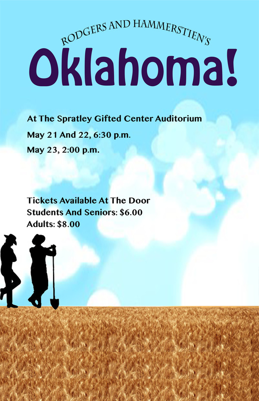
The design process I used for this went from planning it, to getting pictures, to putting them together and editing the whole thing. The best element in the poster would be the clouds. I feel I did not do as good as I could have on my design. If I had had more time, I would most likely have been able to do a lot better on it.
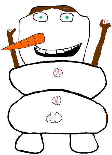
I selected to do a cartoon self of Olaf because I like Olaf and I felt it would be a good choice to do. I do feel successful with the end product because it has all re requirements and it is done. I think it does represent me because it has enough of the things I like or do in real life. 

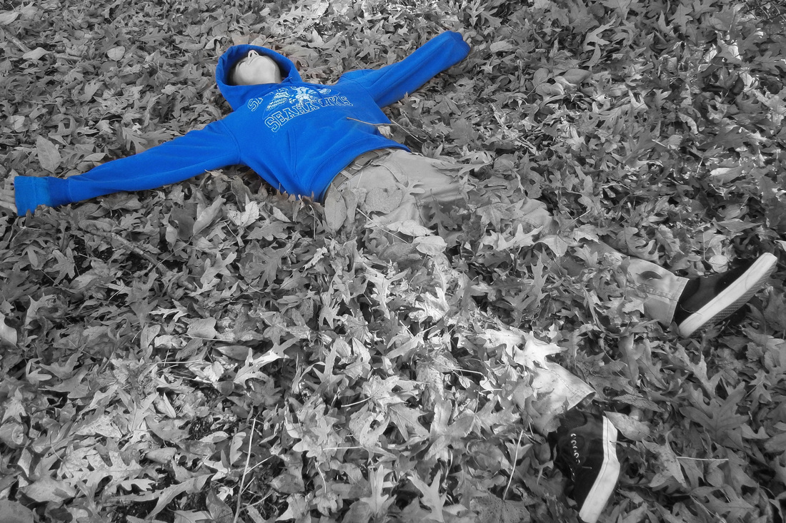
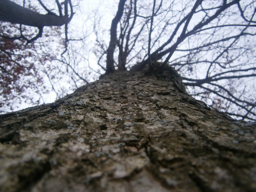
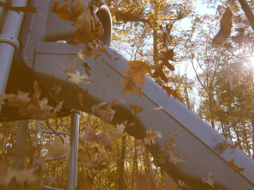
I chose this photograph of Wyatt because I like how it looks like he's falling into the leaves, and that the jacket is emphasized. The jacket makes the picture visually interesting. The technique used was emphasis on the jacket. This is one of my choice pictures I used for the photo unit. Since it was a choice photo, there was no photoshop editing needed. The middle part of the tree is the part in focus. I really like this photo because the focus point on the tree is really good, and I like that I took the photo vertically. This is my sepia picture that I used for my photo unit. To make the photo into sepia, I had an orange/brown layer, and then I used one of the layer adjustments, like blur or dissolve, to create the picture shown. I would say that the leaves are the main focus of the picture. I like this picture because of the leaves falling with the sun in the background.
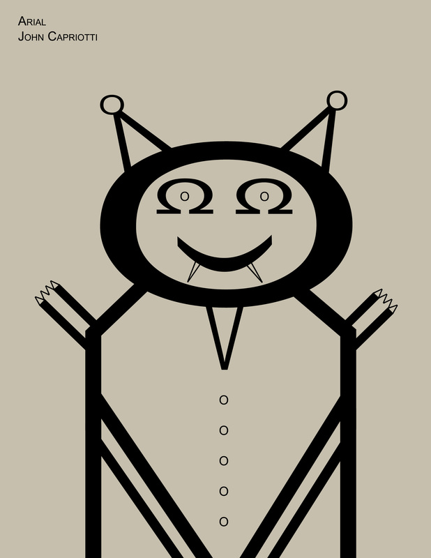
FontBot
For my font bot, I used a V and an O for the ears, and a big O for the head. I also used two Ω (option+z) for the eyes with tiny O-s inside. For the mouth I used a ) turned sideways with two Vs that looked like fangs. for the body/suite I used a bunch of l-s, also with the sides of the hands and stripes on the shirt. The collar on the shirt was a V, and the buttons were O-s. The finger/claw things on the hands were 4 V-s put together. I would find my character at night in the streets because it is a vampire-cat. The colors I used were just black with a background color because my character is black and white. |
|
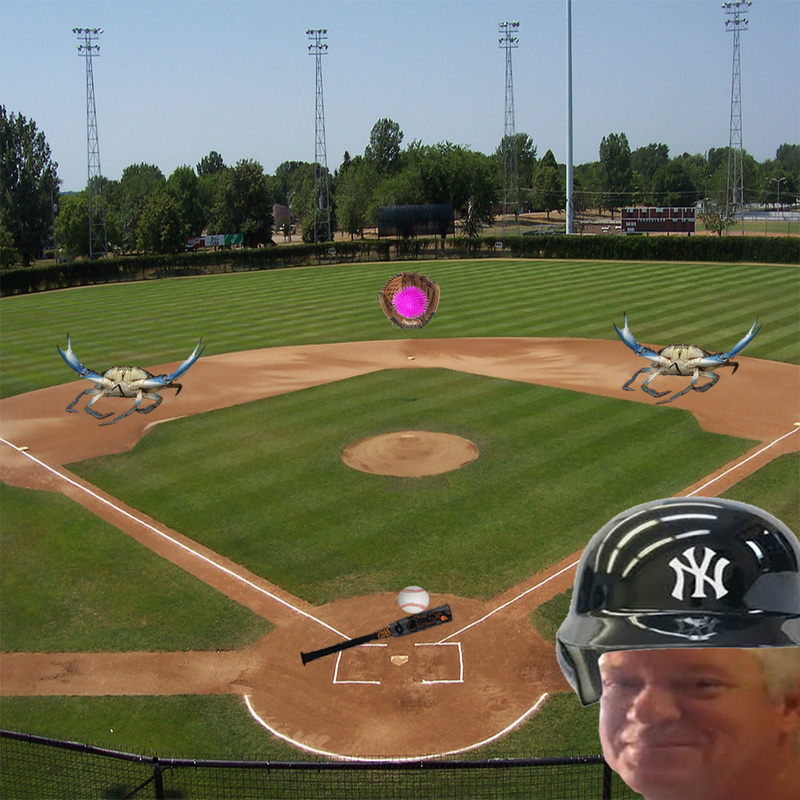
Montage
I chose pictures from the internet that I like (plus a picture of a family member) and put them together to make my montage. I had my dad wearing a baseball helmet because he coaches baseball. I had a picture of my baseball bat hitting a baseball because I play baseball. I also had two crabs because I like going crabbing and fishing. The most emphasized element would be color. |

To make this Square One art I used the tablet with the computer program Photoshop CS6. The tablet was a good tool to use for photoshop, because it was like drawing but the picture went on the computer. It's easier to use a pen to draw than try to use a mouse. My experience with the tablet made it easier to make photoshop projects. In my picture that I made with the tablet I used color and pattern because turtles have a kind of pattern on their shells, and it has color a lot. I chose to do this drawing of a turtle because I like turtles and I figured when I drew it, it would look good as a picture.
|
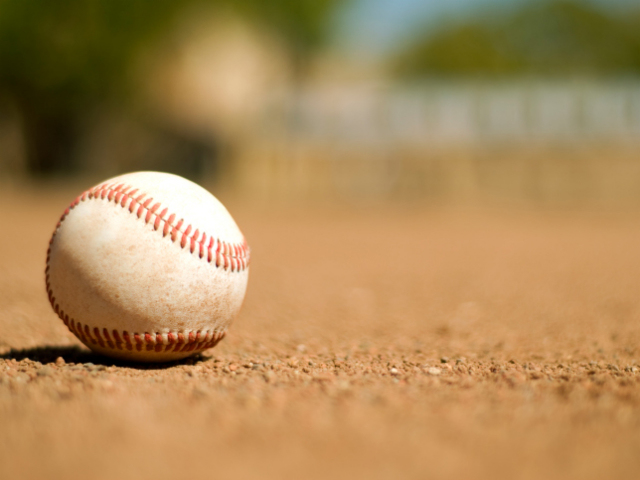
I like this picture because I really like baseball and it has a interesting focus point on the ball.
|
